Mathematics 216 Computer-oriented Approach to Statistics
Computer Lab 1B
with Guided Solutions (Technology Manual)
With the aid of the Guided solution, use StatCrunch to work through each of the following Activities that relate to Chapter 2 in your eText.
Activity 1. Construct a frequency distribution with classes.
Task 1. Example 1 from Elementary Statistics, 6th edition
Example 1 Constructing a Frequency Distribution from a Data Set

Here, you will open the StatCrunch data file GPS.txt from the AU Math216 2020 group folder on the StatCrunch website and construct a frequency distribution. The lower limit of the first class is 65 and the bin width (width of each class) is 40.

Figure 1. Frequency table for GPS price.
Guided Solution 1a
Open the StatCrunch Data File GPS.txt
- Open your web browser.
- Go to the website www.statcrunch.com.
- Sign in with your Pearson MyLab user id and password. This should take you to the StatCrunch home page.
- Click the menu option Groups.
- In the Search box, type the group name “AU Math216 2020”, and hit the Enter key.
- In the next window that displays, click the AU Math216 2020 link.
- In the next window, in the Search box, type GPS to bring up the GPS.txt file link.
- Click on the GPS.txt link to open the GPS data file.
Guided Solution 1b
Create a Bins(Classes) Column as the second column in the data table.
Here, you will create a bins column consisting of the 7 classes shown in the first column of Figure 1 above. For each of these classes, the lower boundary is included as the class, but the upper boundary is not included in that same class.
- Click the menu option sequence Data → Bin.
- With the Bin Column window displayed:
- Select the variable GPS Prices in the Select Column box.
- In the Define Bins section, select Use fixed width bins. Type 65 in the Start at box. Type 40 in the Binwidth box.
In the Bin edges section, select Include left end point. See Figure 2.
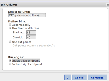
Figure 2. Bin column window.
Click Compute. This will display the Bins column as the second column in the GPS.txt Data Table. See Figure 3 below.
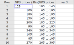
Figure 3. First 10 rows of the GPS.txt data sheet
Guided Solution 1c
Create a frequency table for GPS prices.
Here, you will create the frequency table displayed in Figure 1 above, with the bins column as the first column and other columns for frequencies, relative frequencies, cumulative frequencies, and cumulative relative frequencies.
- Click Stat → Tables → Frequency.
- In the Frequency Table window that displays:
- Click the variable Bin (GPS Prices (in dollars)). This variable will show in the box to the right.
In the Statistics box, hold the Ctrl key down while you click Frequency, Relative Frequency, Cumulative Frequency, Cumulative Relative Frequency. See Figure 4.
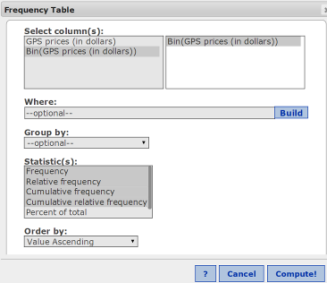
Figure 4. Creating the frequency table for GPS prices.
- Click Compute. This will create the frequency table shown in Figure 1 above.
Guided Solution 1d
Copy the frequency table into a word processing file named ComputerLab1B.
Here, you will open a new word processing file and call it ComputerLab1B; copy and paste the frequency table created in StatCrunch into this blank file; and save this file as ComputerLab1B on your hard drive or personal storage space on the cloud.
- For help with copying StatCrunch data, see Copying Materials from StatCrunch. Hint: In the StatCrunch frequency table, click Ctrl+A, Ctrl+C. In the word processing software, click Ctrl+V.
- Save your Word file as ComputerLab1B. Note that you will NOT be asked to send this file to your tutor.
- You may wish to create a folder called Math 216 and save ComputerLab1B inside it, as you will later be asked to save other solutions in the ComputerLab1B file.
Task 2. Interpretation - Example 1
Insert the questions below into your ComputerLab1B word processing file, under the frequency table you just pasted.
Based on your review of the pasted frequency table, type your answers to these questions in the solutions spaces provided. (If you need help answering these questions, see the Solutions section that follows them.)
The most common price range (class) for the GPS navigators is from $_____ to $_____
Solution:
What percentage of the 30 GPS navigators sampled were in the most common price range?
Solution:
How many GPS navigators sold at a price below $145?
Solution:
What percentage of the 30 GPS navigators sampled sold at less than $185?
Solution:
Remember to resave your file under the file name ComputerLab1B.
Solutions to Task 2
- $105 to $145 (9 in the Frequency column)
- 30% (0.3 in the Relative Frequency column)
- 15 navigators (15 in the Cumulative Frequency column)
- 70% (0.7 in the Cumulative Relative Frequency column)
Task 3. Exercise 29 from Elementary Statistics, 6th edition
Exercise 29. Political Blog Reading Times

In Exercise 29 construct a frequency distribution for the data set using the indicated number of classes. In the table, include the midpoints, relative frequencies, and cumulative frequencies. Which class has the greatest frequency and which has the least frequency?
Here, you will open the StatCrunch data file Ex2_1-29.txt from the AU Math216 2020 group folder on the StatCrunch website and construct a frequency distribution, following the guided solutions. The lower limit of the first class starts with 0, and the bin width is 8 (which implies that the first class is from 0 to 8 but does not include 8).

Figure 5. Frequency Table for Political Blog Reading Times
Guided Solution 3a
Open the StatCrunch Data File Ex2_1-29.txt from the AU Math216 2020 group folder on the StatCrunch website.
Guided Solution 3b
Create a Bins(Classes) Column as the Second Column in the Data Table.
Here, you will create a bins column consisting of the 5 classes shown in the first column of Figure 5 above. For each of these classes, the lower boundary is included as the class, but the upper boundary is not included in that same class.
- Click the menu option sequence Data → Bin.
- With the Bin Column window displayed:
- In the Select Column box, select the variable Minutes reading political blog.
- In the Define Bins section, select Use fixed width bins. Type 0 in the Start at box. Type 8 in the Binwidth box.
- In the Bin edges section, select Include left endpoint.
- Click Compute. This will create the Bins column as the second column in the Data Table.
Guided Solution 3c
Create a frequency table for Minutes Reading Political Blog.
Here, you will create the frequency table displayed in Figure 5 above, with the bins column as the first column and other columns for frequencies, relative frequencies, cumulative frequencies, and cumulative relative frequencies.
- Click the menu option sequence Stat → Tables → Frequency.
- In the Frequency Table window:
- Click the variable Bin (Minutes reading political blog); this will display it in the box to the right.
- In the Statistics box, hold the Ctrl key down while clicking on Frequency, Relative Frequency, Cumulative Frequency, and Cumulative Relative Frequency.
- Click Compute. This will create the frequency table shown in Figure 5 above.
Guided Solution 3d
Copy the frequency table into your word processing file ComputerLab1B.
Here, you will open the word processing file that you named ComputerLab1B, and copy and paste the updated frequency table into it, after the last items that you pasted in the previous exercise.
- For help with copying StatCrunch data, see Copying Materials from StatCrunch.
- Save this file as ComputerLab1B on your hard drive or personal storage space on the cloud.
Task 4. Interpretation - Exercise 29
Insert the questions below into your ComputerLab1B word processing file, under the frequency table you just pasted.
Based on your review of the pasted frequency table, type your answers to these questions in the solutions spaces provided. (If you need help answering these questions, see the Solutions section that follows them.)
How many individuals spent between 8 and 16 minutes per day reading political blogs?
Solution:
What percentage of the individuals sampled, tend to read political blogs between 0 to 8 minutes per day?
Solution:
How many individuals spent less than 16 minutes each day reading political blogs?
Solution:
What percentage of the individuals sampled spent less than 24 minutes each day reading political blogs?
Solution:
Remember to save your work under the same file name: ComputerLab1B.
Solutions to Task 4
- 8 people—see the 8 in the Frequency column in table.
- 32%—see the .32 in the Relative Frequency column
- 16 people—see the 16 in the Cumulative Frequency column
- 76%—see the .76 in the Cumulative Relative Frequency column
Task 5. Exercise 31 from Elementary Statistics, 6th edition
You will open the StatCrunch data file Ex2_1-31.txt from the AU Math216 2020 group folder on the StatCrunch website and construct a frequency distribution, following the guided solutions below. The lower limit of the first class is 1000 and the bin width is 1020 (which implies that the first class is from 1000 to 2020 but does not include 2020).

Figure 6. Frequency Table for July sales
Guided Solution 5a
Exercise 31. July Sales
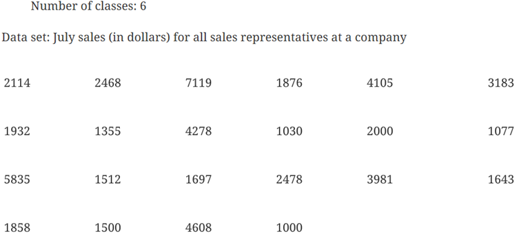
Open the StatCrunch Data File Ex2_1-31.txt from the AU Math216 2020 group folder on the StatCrunch website. You will see July sales as the first column in the data file.
Guided Solution 5b
Create a Bins(Classes) Column as the second column in the data table. Here, you will create a bins column consisting of the 5 classes shown in the first column of Figure 6 above. For each class, the lower boundary is included as the class, but the upper boundary is not included in that same class.
- Follow the steps used for 2.1 Example 1 above (Task 1 Guided Solution 1b), but with the following differences:
- Select the column July sales.
- In Define bins, start at 1000; use Binwidth of 1020.
Guided Solution 5c
Create a frequency table for July sales.
Here, you will create the frequency table displayed in Figure 6 above, with the bins column as the first column and the other columns displaying frequencies, relative frequencies, cumulative frequencies, and cumulative relative frequencies.
- Follow the steps used for 2.1 Example 1 above (Task 1 Guided Solution 1c) with the following difference:
- Select the column Bin (July sales).
Guided Solution 5d
Copy the frequency table into a word processing file
- In the word processing file ComputerLab1B, type Exercise 31 page 52 below the bottom item.
- For help with copying StatCrunch data, see Copying Materials from StatCrunch.
- Save your file, ComputerLab1B.
Task 6. Interpretation - Exercise 31
Insert the questions below into your ComputerLab1B word processing file, under the frequency table you just pasted.
Based on your review of the pasted frequency table, type your answers to these questions in the solutions spaces provided. (If you need help answering these questions, see the Solutions section that follows them.)
What monthly sales range (class) occurred most frequently in July?
Solution:
What percentage of the sales representatives earned between $3040 and $4060 in sales in July?
Solution:
How many sales representatives earned less than $3040 per month in July?
Solution:
What percentage of the sales representatives earned less than $4060 in July?
Solution:
Remember to save your work as ComputerLab1B.
Solutions to Task 6
- $1,000 to $2,020 (12 in the Frequency column in table)
- 9.09% (.0909 in the Relative Frequency column)
- 15 sales representatives (15 in the Cumulative Frequency column)
- 77% (.7727 in the Cumulative Relative Frequency column)
Activity 2. Construct a frequency histogram.
Task 7. Example 3 from Elementary Statistics, 6th edition
Here, you will open the StatCrunch data file GPS.txt from the AU Math216 2020 group folder on the StatCrunch website and construct a frequency histogram, labeled with class boundaries, following the guided solutions below. The lower limit of the first class starts with 64.5 and the bin width (width of each class) is 40. Your graph should look like Figure 7.
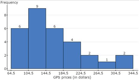
Figure 7. Frequency Histogram for GPS Prices
Guided Solution 7a
Open the StatCrunch Data File GPS.txt from the AU Math216 2020 group folder on the StatCrunch website.
Guided Solution 7b
Using StatCrunch, create a frequency histogram for GPS Prices.
You will create the frequency histogram displayed in Figure 7 above, with the bins starting at 64.5 and a bin width of 40.
- Click the menu option sequence Graph → Histogram.
- In the Histogram window:
- In the Select Column box, select the variable GPS prices (in dollars); it will display in the box to the right.
- In the Type box, select Frequency.
- In the Bins section, type 64.5 in the Start at box and 40 in the width box (see Figure 8).
- Select the Display option: Value above bar
- Click Compute to display the frequency histogram shown in Figure 7 above.
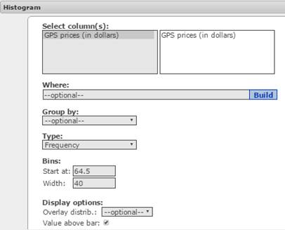
Figure 8. Histogram window.
Guided Solution 7c
Copy the frequency histogram into your word processing file ComputerLab1B.
- Open the word processing file ComputerLab1B, and type Example 3 page 44 below the bottom item.
- For help with copying StatCrunch data, see Copying Materials from StatCrunch.
- Save your Word file, ComputerLab1B.
Task 8. Exercise 31 from Elementary Statistics, 6th edition
Here, you will open the StatCrunch data file Ex2_1-31.txt from the AU Math216 2020 group folder on the StatCrunch website and construct a frequency histogram, following the guided solutions below. The lower limit of the first class is 999.5 and the bin width is 1020.
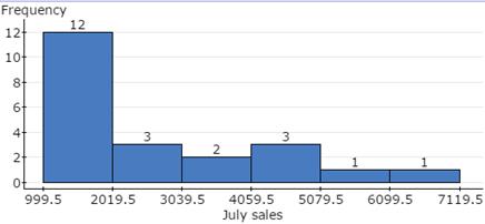
Figure 9. Frequency histogram for July sales.
Guided Solution 8a
Open the StatCrunch Data File Ex2_1-31.txt from the AU Math216 2020 group folder on the StatCrunch website.
Guided Solution 8b
Create a Frequency Histogram for July Sales.
Here, you will create the frequency histogram displayed in Figure 9 above, with the bins starting at 999.5 and having a bin width of 1020.
- Click the menu option sequence Graph → Histogram. In the histogram window:
- In the Select column box, select the variable July sales.
- In the Type box, select Frequency.
- In the Bins section, type 999.5 in the Start at box, and type 1020 in the Width box.
- Select the Display option: Value above bar.
- Click Compute to display the frequency histogram.
Guided Solution 8c
Copy the Frequency Histogram into a word processing file ComputerLab1B.
- Open the ComputerLab1B word processing file and, below the bottom item, type Exercise 31 page 52.
- For help with copying StatCrunch data, see Copying Materials from StatCrunch.
- Save your Word file, ComputerLab1B.
Activity 3. Construct a relative frequency histogram.
Task 9. Example 5 from Elementary Statistics, 6th edition
Here, you will open the StatCrunch data file GPS.txt and construct a relative histogram, labeled with class boundaries, following the guided solutions below. The lower limit of the first class is 64.5 and the bin width (width of each class) is 40. Your graph should look like Figure 11.
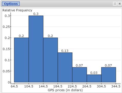
Figure 10. Relative Frequency Histogram for GPS Prices
Guided Solution 9a
Open the StatCrunch Data File GPS.txt from the AU Math216 2020 group folder on the StatCrunch website.
Guided Solution 9b
Create a relative frequency histogram for GPS prices.
Here, you will create a relative frequency histogram displayed in Figure 10 above, with the bins starting at 64.5 and a bin width of 40.
- Click the menu option sequence Graph → Histogram.
- In the Histogram window:
- in the Select column box, select the variable GPS prices (in dollars).
- In the Type box, select Relative Frequency.
- In the Bins section, type 64.5 in the Start box and 40 in the Width box.
- Select the Display option: Value above bar. See Figure 11.
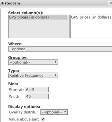
Figure 11. Histogram window.
- Click Compute to display the histogram shown in Figure 10.
Guided Solution 9c
Copy the relative frequency histogram into the Word file ComputerLab1B.
- For help with copying StatCrunch data, see Copying Materials from StatCrunch.
- Save your Word file, ComputerLab1B.
Task 10. Exercise 35 from Elementary Statistics, 6th edition
Exercise 35. Taste Test

Here, you will open the StatCrunch data file Ex2_1-35.txt and construct a relative histogram, labeled with class boundaries, following the guided solutions below. The lower limit of the first class is .5 and the bin width is 2. Your graph should look like Figure 12.
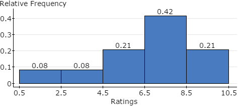
Figure 12. Relative Frequency Histogram for Taste Test Ratings
Guided Solution 10a
Open the StatCrunch Data File Ex2_1-35.txt from the AU Math216 2020 group folder on the StatCrunch website.
Guided Solution 10b
Create a relative frequency histogram for Ratings. Here, you will create a relative frequency histogram displayed in Figure 12 above, with the bins starting at .5 and having a bin width of 2.
- Click the menu option sequence Graph → Histogram.
- In the histogram window:
- In the Select Column box, select the variable Ratings.
- In the Type box, select Relative Frequency.
- In the Bins section, type .5 in the Start box and 2 in the Width box.
- Select the Display option: Value above bar.
- Click Compute to display the histogram as in Figure 12.
Guided Solution 10c
Copy the frequency histogram into your word processing file ComputerLab1B.
- Open the word processing file ComputerLab1B, and type Exercise 35 page 52 below the bottom item.
- For help with copying StatCrunch data, see Copying Materials from StatCrunch.
- Save your Word file, ComputerLab1B.
Activity 4. Construct a frequency polygon.
Task 11. Example 4 from Elementary Statistics, 6th edition
Here, you will open the StatCrunch data file GPS.txt and construct a frequency polygon, following the guided solutions below. Your graph should look like Figure 13.
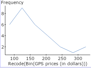
Figure 13. Frequency POLYGON for GPS Prices
In constructing the frequency polygon, you will use StatCrunch to plot the midpoint of each class, defined by upper and lower class boundaries, against the class frequency.
Guided Solution 11a
Open the StatCrunch Data File GPS.txt from the AU Math216 2020 group folder on the StatCrunch website.
Guided Solution 11b
Create a Bins(Classes) Column as the second column in the data table.
Here, you will create a bins column consisting of the 7 classes shown in the first column of Figure 1 above. For each of these classes, the lower boundary is included as the class, but the upper boundary is not included in that same class.
- Click the menu option sequence Data → Bin.
- In the Bin Column window displayed:
- In the Select Column box, select the variable GPS Prices (in dollars).
- In the Define Bins section, select Use fixed width bins. Type 64.5 in the Start box; type 40 in the Binwidth box.
- In the Bin edges section, select Include left endpoint.
Click Compute to display the Bins column as the second column. Figure 14 shows the first two rows of the data table.

Figure 14. Bin column displays the class boundaries related to each GPS price.
Guided Solution 11c
Recode the boundaries for each class with the class midpoint value, and display in the third column in the data table.
Here, you will display a class midpoint value beside each class in the Bin Column.
- Click the menu option sequence Data → Recode.
- In the Recode Column window that opens:
- In the Select Column section, click Bin(GPS Prices (in dollars)).
- Click Compute to display a table showing the original Bins column and the recoded column that you want to create.
In the Recoded column, calculate and type the class midpoint values (as shown in Figure 15) as the values to be inserted in the Recode column.
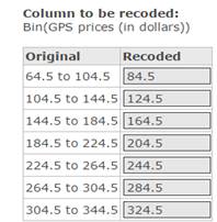
Figure 15. Typing class midpoints in the Recoded column.
- Click Compute to create a new column, Recode(Bin(GPS prices (in dollars))), which displays the midpoint of each class in the data table.
Guided Solution 11d
Create a frequency table, with the first column showing the recoded values (class midpoints), and the second column showing the related frequencies.
- Click the menu option sequence Stat → Tables → Frequency.
- In the Frequency Table window:
- In the Select Columns box, click Recode(Bin(GPS prices (in dollars))) as the variable.
- In the Statistics box, select Frequency.
- In the Output section, select Store output in data table.
Click Compute. This displays two new columns in the data table, shown in Figure 16.
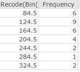
Figure 16. Two new variables in data table: recode (showing class midpoints) and frequency.
Guided Solution 11e
Create a scatter plot graph, with the recode values being the x-values and the frequency values being the y-values.
- Click the menu option sequence Graph → Scatter Plot.
- In the Scatter Plot windows:
- Select the Recode(Bin(GPS prices (in dollars))) as the x column variable.
- Select Frequency as the y column variable.
- In the Display box, select Lines.
- Click Compute to display the Frequency polygon, as shown in Figure 13 above.
Guided Solution 11f
Paste the Frequency Polygon into word processing file ComputerLab1B.
- Open the word processing file ComputerLab1B and, below the bottom item, type Example 4 page 45.
- For help with copying StatCrunch data, see Copying Materials from StatCrunch.
- Save your Word file, ComputerLab1B.
Task 12. Interpretation - Example 4 page 45
Insert the question below into your ComputerLab1B word processing file, under the frequency table you just pasted.
Based on your review of the pasted polygon, type your answer to this question in the solution space provided. (If you need help answering the question, see the Solution that follows.)
Is the distribution of navigator prices positively or negatively skewed? Interpret your answer.
Solution:
Solution to Task 12
- The navigator prices are positively skewed. This means that, while there are a few non-typical high prices, most of the prices are in the lower price ranges.
Activity 5. Construct a pie chart to analyze qualitative survey data.
In Computer Lab 1, you created the data file STAT101 Survey Responses and saved it in your My Data Folder on the StatCrunch website. This data file contains the responses from twenty students to the two questions “What is your gender?” and “What final course grade do you expect?”
Task 13. Create a pie chart.
Here, you will open the data file STAT101 Survey Responses from your My Data Folder and create a pie chart describing the relative frequencies of the two genders in the survey sample.
Guided Solution 13a
Open the Stat101 Survey Responses data file from your My Data Folder on the StatCrunch website.
- In your web browser, go to www.StatCrunch.com and sign in.
- Click the menu option MyStatCrunch. Click the My Data link.
Click STAT101 Survey Responses. This will open the STAT101 data in the data table, with 20 data entries displayed for the two variables Gender and Grade. Figure 17 shows the first three rows.

Figure 17. First three rows of the Stat101 Survey Responses data file.
Guided Solution 13b
Recode the Gender variable values.
Before conducting statistical analysis involving qualitative variables such as Gender, it is appropriate to recode the M value to display as Male and the F value as Female. This makes it easier to understand the statistical analysis graphs and tables. Here, you will use StatCrunch to do this recoding.
- With theStat101 data file open, Click the menu option sequence Data → Recode.
- In the Recode Column window:
- click Gender in the Select Column section
- Click Compute. This will display a table with the Original column and a Recode column
Edit the Recode column to show Female as the first value and Male as the second value. See Figure 18.

Figure 18. Recoding the Gender variable.
- Click Compute. This will show the data table with a new Recode (Gender) column with 20 recoded values.
Guided Solution 13c
Create a pie chart showing the Relative Frequencies for the Recoded Gender Values.
- With theStat101 data table open, click the menu option sequence Graph → Pie Chart → With Data.
- In the Pie Chart With Data window:
- In the Select Column section, click Recode(Gender).
- In the Display box, click Percent of Total.
Click Compute to create the pie chart as shown in Figure 19.
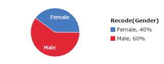
Figure 19. Pie chart: Relative Frequencies for Gender Values
Guided Solution 13d
Copy the pie chart into your word processing file ComputerLab1B.
- Open the word processing file ComputerLab1B, and type Pie Chart for Gender below the bottom item.
- For help with copying StatCrunch data, see Copying Materials from StatCrunch.
- Save your Word file, ComputerLab1B.
Task 14. Interpretation - Pie Chart for Gender for Stat101 Survey Responses Data File
Insert the question below into your ComputerLab1B word processing file, under the pie chart you just pasted.
Based on your review of the pasted pie chart, type your answer to this question in the solution space provided. (If you need help answering the question, see the Solution that follows.)
What is the most frequent gender in the Stat101 survey sample?
Solution:
Solution to Task 14
- The predominant gender is male, with only 40% of the sample being females and 60% males.
Activity 6. Construct a Pareto chart for qualitative data.
Task 15. Construct a Pareto chart for qualitative data.
Here, you will construct a Pareto chart, which is a vertical bar chart. Bar height will reflect the frequency of the data value. The bars are in order of decreasing height, with the tallest bar on the left.
Guided Solution 15a
Create a StatCrunch data file based on the data in Figure 20 below.
Figure 20 shows the results of a survey of 55 employees working in a large car dealership. The survey asked employees to identify their favourite day of the week. The results are summarized in the form of a completed frequency distribution in Figure 20.
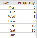
Figure 20. Results of care dealership survey.
- Open StatCrunch with a blank data table.
- Type Day as the first variable (column) name and Frequency as the second variable (column) name.
- Enter all the data values and their frequencies as shown in Figure 20.
- Click Data → Save.
- Type the filename FavouriteWeekday.
- Click the Save button to save to your My Data folder. Keep this data table displayed for Guided Solution 15b.
Guided Solution 15b
Create a Pareto chart for the data in the FavouriteWeekday data file.
- With the FavouriteWeekday data file open, click the menu option sequence Graph → Bar Plot → With Summary.
- In the Bar Plot With Summary Window:
- in the Categories in box, select the variable Day.
- In the Counts in box, select the variable Frequency.
- In the Order by box, select Count Descending.
Under Display, select Value above bar. See Figure 21.
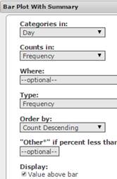
Figure 21. Options for Frequency Pareto Chart
Click Compute to display the Pareto chart as shown in Figure 22.
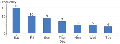
Figure 22. Pareto chart for FavouriteWeekday.
Guided Solution 15c
Copy the Pareto chart into your word processing file ComputerLab1B.
- Open the word processing file ComputerLab1B, and type Pareto Chart for FavouriteWeekday Data File below the bottom item.
- For help with copying StatCrunch data, see Copying Materials from StatCrunch.
- Save your Word file, ComputerLab1B.
Task 16. Interpretation - Pareto Chart for FavouriteWeekday data file
Insert the question below into your ComputerLab1B word processing file, under the Pareto chart you just pasted.
Based on your review of the pasted Pareto chart, type your answer to this question in the solution space provided. (If you need help answering the question, see the Solution that follows.)
What are the top three favourite weekdays of the car dealership employees?
Solution:
Solution to Task 16
- Top three favourite days are: Saturday, Friday, and Sunday.
Activity 7. Construct a stem-and-leaf plot for quantitative data.
Task 17. Exercise 21 from Elementary Statistics, 6th edition
Exercise 21. Highest Paid CEOs

Here, you will open the StatCrunch data file Ex2_2-21.txt and construct a stem-and-leaf plot following the guided solutions below.
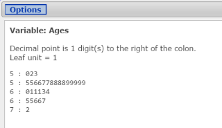
Figure 23. Stem-and-leaf plot for ages of highest-paid CEOs.
Guided Solution 17a
Open the StatCrunch Data File Ex2_2-21.txt from the AU Math216 2020 group folder on the StatCrunch website.
Guided Solution 17b
Create a stem-and-leaf plot for the Ex2_2-21.txt data file.
- With your the data file Ex2_2-21.txt open, click the menu option sequence Graph → Stem and Leaf
- In theStem and Leaf Plot window:
- In the Select Columns box, select the variable Ages.
- In the Leaf Unit box, select 1.
- In the Outlier Trimming box, select None.
- Click Compute to display the stem-and-leaf plot for Ages as shown in Figure 25 above.
Guided Solution 17c
Copy the stem-and-leaf plot into your word processing file ComputerLab1B.
- Open the word processing file ComputerLab1B, and type Stem-and-leaf Plot for Ages of Highest-paid CEOs below the bottom item.
- With your cursor in the stem-and-leaf window, click Ctrl+A to select the entire stem-and-leaf plot.
- With your cursor in your Word file below the heading Stem-and-leaf Plot for Ages of Highest-paid CEOs, click Paste or Ctrl+V to paste the plot into the file.
- Save your Word file, ComputerLab1B.
Task 18. Interpretation - Stem-and-leaf plot for Ages of Highest Paid CEOs
Insert the question below into your ComputerLab1B word processing file, under the stem-and-leaf plot you just pasted.
Based on your review of the pasted stem-and-leaf plot, type your answer to this question in the solution space provided. (If you need help answering the question, see the Solution that follows.)
How many CEOs are in their fifties? What percentage of all CEOs surveyed are in their fifties?
Solution:
Solution to Task 18
- 18 CEOs or (18/30) = .60 or 60% of those surveyed.
Activity 8. Work with measures of central tendency: mean, median, mode.
Task 19. Try It Yourself 2 from Elementary Statistics, 6th edition
Open the StatCrunch data file TIY2_3-2.txt and compute the mean, median, and mode of the ages of 25 rock fans, following the guided solutions below.

Figure 24 describes the StatCrunch output for these three measures of central tendency in table form.
| Column | Mean | Median | Mode |
| Ages of fans | 25.6 | 24 | 21 |
Figure 24. Summary Statistics table: Mean, median, mode ages of rock fans.
Guided Solution 19a
Open the StatCrunch data file TIY2_3-2.txt from the AU Math216 2020 group folder on the StatCrunch website.
Guided Solution 19b
Compute the mean, median, and mode for ages of fans.
Here, you will create the Mean, Median, and Mode table shown in Figure 24 above.
- Click the menu option sequence Stat → Summary Stats → Columns
- In the Summary Stats window:
- In the Select Column box, click the variable Ages of fans.
In the Statistics box, hold the Crtl key down while clicking on Mean, Median, and Mode to select these measures. See Figure 25.
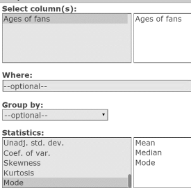
Figure 25. Summary Stats window.
- Click Compute to display the Mean, Median, and Mode table as shown in Figure 24 above.
Guided Solution 19c
Copy the Summary statistics table into your word processing file ComputerLab1B.
- Open the word processing file ComputerLab1B, and type Mean, Median, Mode for Ages of Fans below the bottom item.
- For help with copying StatCrunch data, see Copying Materials from StatCrunch.
- Save your Word file, ComputerLab1B.
Task 20. Interpretation - Summary Statistics Table on Mode, Median, and Mean
Insert the questions below into your ComputerLab1B word processing file, under the Summary statistics table you just pasted.
Based on your review of the pasted Summary statistics table, type your answers to these questions in the solutions spaces provided. (If you need help answering these questions, see the Solutions section that follows them.)
What is the most frequently occurring age in this sample?
Solution:
What is the middle age in this sample?
Solution:
What measure is based on a calculation involving all 25 age values?
Solution:
Is the sample of 25 ages positively or negatively skewed? Explain.
Solution:
Solutions to Task 20
- Solution: Mode = 21
- Solution: Median = 24
- Solution: Mean = 25.6
- Solution: As the mean exceeds the median, the data is positively skewed.
Activity 9. Work with measures of variation: range, standard deviation, variance
Task 21. Exercise 15 from Elementary Statistics, 6th edition
Open the StatCrunch data file Ex2_4‑15.txt and compute the range, standard deviation, variance of the ages of 20 clothing shoppers, following the guided solutions below.
Exercise 15. Age of Shoppers

Figure 26 describes the StatCrunch output for these three measures of variation in table form.

Figure 26. Range, standard deviation, variance of the ages of clothing shoppers.
Guided Solution 21a
Open the StatCrunch Data File Ex2_4-15.txt from the AU Math216 2020 group folder on the StatCrunch website.
Guided Solution 21b
Compute the range, standard deviation, variance for a sample of ages of clothing shoppers.
Here, you will create the Range, Standard Deviation, Variance table displayed in Figure 28 above.
- Click the menu option sequence Stat → Summary Stats → Columns.
- In the Summary Stats window:
- In the Select Columns box, click the variable Ages (in years).
In the Statistics box, hold the Crtl key down while clicking Range, Std. dev., and Variance to select these measures. See Figure 27.
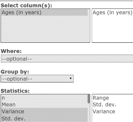
Figure 27. Summary Stats window.
- Click Compute to display the Range, Std. dev., and Variance table as shown in Figure 26.
Guided Solution 21c
Copy the Summary statistics table into your word processing file ComputerLab1B.
- Open the word processing file ComputerLab1B, and type Range, Std. dev., Variance for Ages of Clothing Shoppers below the bottom item.
- With your cursor in the Summary statistics table, click Ctrl+A to select the entire table. Then click Ctrl+C to copy the statistics.
- With your cursor in your Word file below the heading Range, Std. dev., Variance for Ages of Clothing Shoppers, click Paste or Ctrl+V to paste the table into the file.
- Save your Word file, ComputerLab1B.
Task 22. Interpretation - Summary Stats Table on Range, St. dev., Variance
Insert the question below into your ComputerLab1B word processing file, under the Summary Stats table you just pasted.
Based on your review of the pasted table, type your answer to this question in the solution space provided. (If you need help answering the question, see the Solution that follows.)
In this sample of shoppers, the typical shopper’s age is approximately ________ years above or below the mean age of 17 years age.
Solution:
Solution to Task 22
- In this sample of shoppers, the typical shopper’s age is approximately 2.59 years (standard deviation) above or below the mean age of 17 years age.
Activity 10. Work with measures of position: Q1, Q2, Q3, Interquartile Range.
Task 23. Example 2 from Elementary Statistics, 6th edition
Open the StatCrunch data file Tuition.txt and compute the First, Second, and Third Quartiles, and the Interquartile Range for the tuition costs (in thousands of dollars) for 25 colleges, following the guided solutions below.
Example 2 Tuition Costs

Figure 28 shows the StatCrunch output for these four measures of position in table form.

Figure 28. Q1, Q2 (median), Q3, interquartile range for College tuition costs.
Guided Solution 23a
Open the StatCrunch Data File Tuition.txt from the AU Math216 2020 group folder on the StatCrunch website.
Guided Solution 23b
Compute the Q1, Q2 (median), Q3, Interquartile Range for College Tuition Costs.
Here, you will create the Summary statistics table displayed in Figure 28 above.
- Click the menu option sequence Stat → Summary Stats → Columns.
- In the Summary Stats window:
- In the Select Columns box, click the variable Tuition costs (in thousands of dollars) to select it.
In the Statistics box, hold the Crtl key down while clicking Q1, Median, Q2, and IQR to select these measures. See Figure 29.
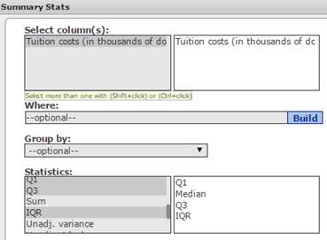
Figure 29. Summary Stats Window
- Click Compute to display the Summary statistics table shown in Figure 28 above.
Guided Solution 23c
Copy the Summary statistics table into your word processing file ComputerLab1B.
- Open the word processing file ComputerLab1B, and type Q1, Q2, Q3, and Interquartile Range for College Tuition Costs below the bottom item.
- For help with copying StatCrunch data, see Copying Materials from StatCrunch.
- Save your Word file, ComputerLab1B.
Task 24. Interpretation of Summary Statistics table on Q1, Q2, Q3, Interquartile Range
Insert the questions below into your ComputerLab1B word processing file, under the Summary statistics table you just pasted.
Based on your review of the pasted table, type your answers to these questions in the solutions spaces provided. (If you need help answering these questions, see the Solutions section that follows them.)
Approximately 25% of the colleges surveyed charge a tuition of $________ or less, and about half of the colleges charge a tuition of $________ or less.
Solution:
Approximately 25% of the colleges surveyed charge a tuition of $________ or more.
Solution:
The tuition costs of the colleges that fall in the middle 50% of college tuition costs vary by, at most, $________.
Solution:
Solutions to Task 24
- Approximately 25% of the colleges surveyed charge a tuition of $27,000 (Q1) or less, and about half of the colleges charge a tuition of $32,000 (median) or less.
- Approximately 25% of the colleges surveyed charge a tuition of $40,000 (Q3) or more.
- The tuition costs of the colleges that fall in the middle 50% of college tuition costs vary by, at most, $13,000 (Q3–Q1).
Activity 11. Construct a box-and-whisker plot for quantitative data.
Task 25. Exercise 25 from Elementary Statistics, 6th edition
Open the StatCrunch data file Ex2_5-25.txt and create a box-and-whisker plot for the number of hours TV watched per day by a sample of 28 people, following the guided solutions below.
Exercise 25. TV Viewing

Figure 30 shows the StatCrunch box-and-whisker plot. Construct this plot and use it to quickly determine 6 measures for number of hours of TV watched per day: minimum, maximum, Q1, Q2, Q3, and IQR.

Figure 30. Box-and-whisker plot for hours of TV watched per day.
Guided Solution 25a
Open the StatCrunch data file Ex2_5-25.txt from the AU Math216 2020 group folder on the StatCrunch website.
Guided Solution 25b
Create a box-and-whisker plot for hours of TV watched per day.
- Click the menu option sequence Graph → Boxplot.
- In the Boxplot window
- In the Select Columns box, click the variable Hours of TV watched.
- In the Other options section, click Draw boxes horizontally, to ensure that the plot is aligned horizontally.
In the Graph properties section, in the box X-axis label, type Hours of TV Watched Per Day. See Figure 31.
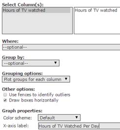
Figure 31. Boxplot window.
- Click Compute to display the box-and-whisker plot shown in Figure 30 above.
Guided Solution 25c
Copy the box-and-whisker plot into your word processing file ComputerLab1B.
- Open the word processing file ComputerLab1B, and type Box-and-whisker Plot for Hours of TV Watched Per Day below the bottom item.
- For help with copying StatCrunch data, see Copying Materials from StatCrunch.
- Save your Word file, ComputerLab1B.
Task 26. Interpretation of the Box-and-whisker Plot
- With the box-and-whisker plot displayed in the Boxplot window in StatCrunch, quickly determine the six measures for Hours of TV Watched per Day: Minimum, Maximum, Q1, Q2, Q3, and IQR. Note the Guided solution below.
Guided Solution 26
Based on the box-and-whisker plot, find: Minimum, Maximum, Q1, Q2, Q3, and IQR.
With the box-and-whisker plot open in StatCrunch, place your cursor on the solid part of the box. A small window will pop up, as shown in Figure 32.
# Values: 28
IQR: 3
Min: 0
Q1: 2
Median: 4
Q3: 5
Max: 9Figure 32. Pop-up window for box-and-whisker plot.
- Type each of these 6 measures in the word processing file ComputerLab1B just below the box-and-whisker plot that you just pasted.
- Save your Word file, ComputerLab1B.
Activity 12. Apply tools of descriptive statistics to subsets of data.
If a data file includes both qualitative and quantitative variables, tools of descriptive statistics can be applied to subsets of the data.
For example, the Stat 101 survey questionnaire in Activity 3 in Computer Lab 1 contained two variables—Gender (qualitative) and Grade (quantitative). You will recall that twenty students responded to this survey; in analyzing the survey responses, typically summary measures would be computed, or graphs would be created, for all twenty students.
Another alternative is to break the data into two subsets: a grades subset for male students and a grades subset for female students. Summary measures could then be computed, or graphs created, for each subset, and results of the two subsets could be compared.
Task 27. Work with and Compare Subsets
The task at hand, then, is to:
- Open the STAT101 Survey Responses data file from your My Data folder at StatCrunch.com.
- Compute the mean, median, standard deviation, and 50th and 90th percentiles (P50, P90) for the grades for both the male and female subsets.
- Create box-and-whisker plots for the grades of both the male and female subsets.
Figure 33 shows the StatCrunch output for the measures, mean, median, standard deviation, and 50th and 90th percentiles (P50, P90), in table form.

Figure 33. Mean, Median, Standard Deviation, P50, P90 for Grades
Figure 34 shows the Stat 101 survey.
| Please circle the survey codes or fill in the numeric amounts that apply to you below. |
Variable | Text Code |
| 1. Please check your gender. | Gender | |
| ☐ male | ______ M | |
| ☐ female | ______ F | |
| Variable | Numeric Value | |
| 2. Please indicate the final grade you expect to achieve in this course. |
Grade | ______ |
Figure 34. Stat101 survey.
In Activity 3 in Computer Lab 1, you created the StatCrunch data file Stat101 Survey Responses consisting of the twenty student responses for the two variables Gender and Grade. You then saved this data file to your My Data folder on the StatCrunch website.
Open this data file, following the guided solutions steps below.
Guided Solution 27a
Open the Stat101 Survey Responses file from the My Data folder on the StatCrunch website.
- Sign in to StatCrunch. (If you need help, see Accessing and Working in StatCrunch on the course home page.)
- Click MyStatCrunch.
Click My Data (see Figure 35.)

Figure 35. My Data Link in MyStatCrunch
Click the STAT101 Survey Responses link to open the STAT101 data table. (See Figure 36)

Figure 36. STAT101 Survey Responses link in your My Data folder on StatCrunch.
Guided Solution 27b
Computing the Mean, Median, Standard Deviation, P50, and P90 for Student Grades For Male and Female Subsets.
Here, with the STAT101 Survey Responses data file open, you will create the Mean, Median, Standard Deviation, P50, P90 table for Grades shown in Figure 33.
- Click the menu option sequence Stat → Summary Stats → Columns.
- In the Summary Statistics window:
- In the Select columns box, click the variable Grade.
- In the Group by box, select the variable Gender.
- In the Statistics box, hold the Crtl key down while clicking on Mean, Median, and Standard Deviation.
In the Percentiles box, type 50, 90. See Figure 37.
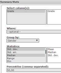
Figure 37. Summary Statistics Window: Mean, Median, Standard Deviation, P50, and P90 for Grades: Male and Female Subsets
- Click Compute to display the Mean, Median, Standard Deviation, and P50 and P90 table as shown in Figure 33.
Guided Solution 27c
Copy the Mean, Median, Standard Deviation, P50, P90 table into your word processing file ComputerLab1B.
- Open the word processing file ComputerLab1B, and type Mean, Median, Standard Deviation, P50, P90 for Grades for Male and Female Subsets of the Stat101 Students below the bottom item.
- For help with copying StatCrunch data, see Copying Materials from StatCrunch.
- Save your Word file, ComputerLab1B.
Task 28. Interpretation - Mean, Median, Standard Deviation, P50, P90 Table
Insert the questions below into your ComputerLab1B word processing file, under the Mean, Median, Standard Deviation, P50, P90 table you just pasted.
Based on your review of the pasted Mean, Median, Standard Deviation, P50, P90 table, type your answers to these questions in the solutions spaces provided. (If you need help answering these questions, see the Solutions section that follows them.)
The mean grade for the female students = _____ and the mean grade for the male students = _____.
Solution:
Which subgroup of students displayed the greatest variability of grades? Explain.
Solution:
Interpret the P50 and P90 grades for each group of students.
Solution:
Is the subset of grades for the female students positively or negatively skewed? Interpret this result.
Solution:
Is the subset of grades for the male students positively or negatively skewed? Interpret this result.
Solution:
Solutions to Task 28
- The mean grade for the female students = 88.75 and the mean grade for the male students = 60.4167.
- The standard deviation for females = 6.4086, and the standard deviation for males = 17.5108. This means that the grades for the males were much more variable. The typical female grade was only approximately 6.4086 marks above or below the mean of 88.75 marks, while the typical male grade was approximately 17.5108 marks above or below the mean of 60.4167 marks.
For the female students, the P50 = 90 and the P90 = 95. This means that 50% of the female students got 90% or less, while 90% of the female students got 95% or less.
For the male students, the P50 = 55 and the P90 = 90. This means that 50% of the male students got 55% or less, while 90% of the male students got 90% or less.
- The female grades are negatively skewed, as the mean of 88.75 is less than the median of 90. This means that, while most of the students got above-average grades, there were a few non-typical low grades.
- The male grades are positively skewed, as the mean of 60.4167 is greater than the median of 55. This means that, while most of the male students got below-average grades, there were a few non-typical high grades.
In the next section, you will create separate box-and-whisker plots for the male and female student subsets.
Task 29. Create a box-and-whisker plot.
Here, with the StatCrunch data file STAT101 Survey Responses open, you will create box-and-whisker plots for both the female and male subsets of student grades. Figure 38 shows the box-and-whisker plots.
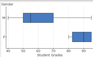
Figure 38. Box-and-whisker plots for female and male subsets of student grades.
Guided Solution 29a
Create box-and-whisker plots for both the male and female subsets of student grades.
- With the StatCrunch data file STAT101 Survey Responses open, click the menu option sequence Graph → Boxplot.
- In the Boxplot window:
- In the Select Columns box, click the variable Grade.
- In the Group by box, select Gender.
- In the Other options section, click Draw boxes horizontally, to ensure that the plot is aligned horizontally.
- In the Graph properties section, in the box X-axis label, type Student Grades and select vertical lines.
- In the For multiple graphs section, select both Use same X-axis and Use same Y-axis. See Figure 39.
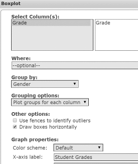
Figure 39. Boxplot window.
- Click Compute to display the box-and-whisker plot shown in Figure 38 above.
Guided Solution 29b
Copy the box-and-whisker plots into your word processing file ComputerLab1B.
- Open the word processing file ComputerLab1B, and type Box-and-whisker Plots for the Grades for both the Male and Female Subsets below the bottom item.
- For help with copying StatCrunch data, see Copying Materials from StatCrunch.
- Save your Word file, ComputerLab1B.
Task 30. Interpretation of Plots
With the box-and-whisker plots displayed in the Boxplot window in StatCrunch, quickly determine the six measures for Grades for each subset: Minimum, Maximum, Q1, Q2, Q3, and IQR. Note the guided solution below.
Guided Solution 30
Based on the box-and-whisker plots for each subset in the StatCrunch boxplot, find: Minimum, Maximum, Q1, Q2, Q3, and IQR for each subset.
With the two box-and-whisker plots displayed in the Boxplot window of StatCrunch, place your cursor in the Male Subset box; a small window will pop up as shown in Figure 40.
Gender: M
# of values: 12
IQR: 20
Min: 40
Q1: 50
Median: 55
Q3: 70
Max: 95Figure 40. Pop-up window for the box-and-whisker plot for the males subset.
With the two Box-and-whisker Plots displayed in the Boxplot window of StatCrunch, move the cursor to touch the solid part of the Female Subset box and a small window will pop up as shown in Figure 41.
Gender: F
# of values: 8
IQR: 12.5
Min: 80
Q1: 82.5
Median: 90
Q3: 95
Max: 95Figure 41. Pop-up window for the box-and-whisker plot for the females subset.
- Open your word processing file ComputerLab1B. In it, type each set of six measures below the box-and-whisker plot that you just pasted.
- Save your Word file, ComputerLab1B.
Activity 13. Conduct contingency table analysis: Relationship between two survey variables.
A contingency table is a popular statistical tool used to analyze the relationship between two qualitative survey variables. NOTE: Although this table is not covered in Chapter 2 of your eText, you are responsible for creating and interpreting this type of statistical table in StatCrunch in the Computer Component of this course.
Figure 42 shows a survey questionnaire that was completed by 25 customers who shop regularly at SuperMart, a neighbourhood supermarket. The survey responses have been entered in a StatCrunch data file called SuperMart. This data file is available from the AU Math216 2020 StatCrunch Group folder at statcrunch.com.
| Please circle the survey codes | Variable | Text Code |
| 1. Please check your gender. | Gender | |
| ☐ male | ______ M | |
| ☐ female | ______ F | |
| 2. Do you typically use the weekly discount coupons offered by SuperMart? |
Discount | |
| ☐ yes | _______Y | |
| ☐ no | _______N |
Figure 42. SuperMart Survey
Task 31. Create a contingency table.
Here, you will create a contingency table for the survey responses in the SuperMart data file, with Gender displayed as the row variable, and Discount displayed as the column variable. Display the Row Percents. The completed Contingency Table is shown in Figure 43.
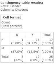
Figure 43. Contingency Table: Gender vs. Discount
According to the contingency table in Figure 43:
- The number of females who responded No to using discount coupons is 1.
- The number of females who responded Yes to using discount coupons is 16.
- The number of males who responded No to using discount coupons is 7.
- The number of males who responded Yes to using discount coupons is 1.
Guided Solution 31a
Open the SuperMart data file from the Groups folder in StatCrunch.
- Go to the StatCrunch MATH 216 Groups page and sign in. (If you need help, see Open a Groups data file in Accessing and Working in StatCrunch on the course home page.)
- Find and click the SuperMart link to open this StatCrunch data file. You should now see the SuperMart data file, showing two variables, Gender and Discount, and 25 rows of survey responses.
Guided Solution 31b
Create a contingency table, Gender vs. Discount.
- With the SuperMart data file open, Click the menu option sequence Stat → Tables → Contingency → With Data.
- In the contingency table window:
- In the Row variable box, select Gender.
- In the Column variable box, select Discount.
- In the Display box, select Row Percent.
- Click Compute to create the contingency table shown in Figure 43 above.
Guided Solution 31c
Copy the contingency table into your word processing file ComputerLab1B.
- Open the word processing file ComputerLab1B, and type Contingency Table: Gender vs. Discount below the bottom item.
- For help with copying StatCrunch data, see Copying Materials from StatCrunch.
- Save your Word file, ComputerLab1B.
Task 32. Interpretation - Interpret the contingency table results in terms of the two variables Gender and Discount.
Insert the questions below into your ComputerLab1B word processing file, under the contingency table you just pasted.
Based on your review of the pasted contingency table, type your answers to these questions in the solutions spaces provided. (If you need help answering these questions, see the Solutions section that follows them.)
Compare the percent of females typically using the discount coupons with the percent of males typically using discount coupons. (These are called “row percents”.)
Solution:
Based on the row percents identified in #1 above, what can you state regarding the relationship between Gender and Discount? Explain.
Solution:
Solutions to Task 32
- While 94.12% of the female customers typically use the discount coupons, only 12.5% of the male customers typically do so.
- In general, female customers typically use the discount coupons, while male customers typically do not use the discount coupons.
